Look beyond the word gray
A light gray floor and a dark charcoal floor create different levels of contrast with a sofa. So do plain surfaces and pronounced grain or veining. Look at the floor beside your existing walls, a light fabric and any wood furniture. Does the gray appear more blue, green or brown in that setting? Check several parts of the room in daylight and during the evening; a reflection can look different from the surface around it. If you are choosing new flooring, compare a real sample in the room rather than treating an online color name as an exact match.
Gray tile: decide how much hard surface remains visible
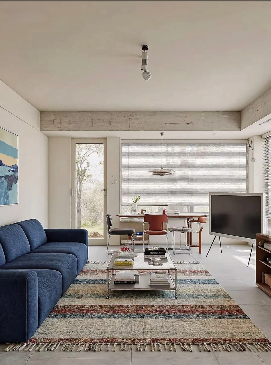
Tile brings grout lines and sometimes a polished finish into the composition. In the blue-sofa reference, a textured striped rug interrupts the pale tile around the main seating group. In the amber-light reference, glossy gray tiles remain visible around a geometric rug, including reflections from the window. Neither room hides the floor completely. If you enjoy its clean lines, you might keep more exposed surface. If the seating area feels too visually hard for your taste, compare a textile with a visibly different texture. Judge the contrast you want rather than assuming every gray tile needs concealing.
Gray wood and wood-look flooring: work with grain as well as color
Planks introduce direction and repeated lines, even when their color is restrained. A pronounced grain can already supply pattern, so compare it with the rug before adding a second busy surface. Wood furniture does not have to use the same gray finish. A lighter or darker wood may create useful separation; an orange-toned piece will make a different contrast from a muted brown one. Put samples beside each other and include any existing cabinetry in the comparison. These are visual decisions. The material, installation and care requirements of wood, laminate and vinyl still need to be checked separately.
Gray carpet: decide what needs contrast, not more softness
Carpet already supplies a textile surface. If the sofa is also gray, notice whether its outline remains distinct from the floor or blends into it. You might introduce contrast through the sofa fabric, wood furniture, artwork or curtains before considering another floor layer. An area rug can add pattern, but it is optional rather than a universal solution. Check the carpet and rug manufacturer’s guidance for any layered arrangement, including backing compatibility and movement. A style photograph cannot confirm that those materials will work together in your home.
Compare two tile rooms with different intentions
The blue-sofa reference keeps a light background and introduces a strong navy seat. Rust and blue bands in the woven rug relate to the seating and nearby dining chairs; the glass table and slim metal frames add another distinct surface. The amber-light reference takes a darker direction with black seating and wood cabinets. Rust, cream and dark sections in the rug connect that furniture with the visible gray floor. Shaded lamps add pools of yellow light. Both compositions retain gray tile, but they pursue different moods. A warm room does not require every furniture piece to be beige, and a gray floor does not require a gray sofa.
Pick a direction before selecting a wall color
For a calm look, compare related light and medium tones with enough difference to see the furniture clearly. For a colorful look, choose a larger colored element and connect it to one or two smaller details. For a moody look, compare deeper furniture and textiles with the actual light available. There is no single warm white or cream that suits every gray floor. If repainting is an option, view paint samples beside the floor in the room. If the walls are staying, build the palette through furniture, rugs, curtains and art around those walls instead.
Review lighting without expecting it to change the material
The amber-light photograph shows a warmer-looking atmosphere around a reflective floor. It does not tell us the bulbs’ specifications or exactly how the room appears at another time of day. In your room, compare the lights you already use while sitting in the places you normally spend time. Notice distracting reflections, overly bright points and whether you can see well enough for your activities. Shaded lighting may help create the atmosphere you want, but changing light does not replace the floor or guarantee a particular color. Check fixture and bulb compatibility for any purchase.
Make a small comparison before a large purchase
Gather a few fabric, rug or finish samples for each direction you are considering. Put them beside the floor and your largest existing piece, then view them together in the light you use. Keep one plain alternative in the comparison so you can see whether a pattern adds something useful. Before ordering a rug or furniture, check dimensions, door operation, stability, care and returns. If you are considering replacement flooring, its suitability and installation are a separate decision from this decorating guide.
STYLE REFERENCES IN THIS GUIDE
Explore the visible design choices in these library rooms.
